Making a group portrait with meaning
The photo Ambachten de Pijp 2015 (at the bottom of this page) is special to me, not just because I consider it to be a beauty in and of itself, but more for its composition and deliberate details. So please have a closer look.
A few years ago I was asked to take a portrait of ‘Ambachten de Pijp’, a group of craftsmen (in Dutch ‘ambachten’ means handcrafts and ‘de Pijp’ refers to a specific neighbourhood in Amsterdam). I'm a member of Ambachten de Pijp myself. Of course, it’s easy to just put people in front of a camera and take their picture, but the result is ordinary and my goal was exactly the opposite. So, I made sure to do my homework – I began by thinking about what I wanted to do and how. Here is my thought process in short.
I started with a question: what defines the members of Ambachten de Pijp? First, we are craftsmen and second, we live in the beautiful city of Amsterdam. As such, I wanted the portrait to historically reference both the Dutch Golden Age (17th century) and the painters of that time, such as Rembrandt and van der Helst, who were of course craftsmen, too. I saw it as a kind of local approach.
So, I went to visit the Rijksmuseum, which is around the corner from de Pijp, and analysed the group portraits I encountered. Composition-wise there were a few options. Moreover: what I love when it comes to photography, and what characterises my own personal style in terms of portraiture, is when the lighting is similar to those of the old Dutch paintings. For one, the light source always comes from the left (except in etchings). But more importantly, and because I’m so focused on light in my own work, I’m most captivated by obscure and darker compositions in which light plays a prominent roll.
Needless to say, I’m a big fan of Rembrandt because of his approach: his attention to light, the expression of character rather than emotion, and his realistic portrayal of people as unique individuals and not as a bunch of beauty queens. When I take someone’s portrait, I’m focused on those areas myself. In fact, I think you could say I’m part of a long tradition, started by Rembrandt and his contemporaries who were the masters when it came to the use of light.
Initially, the following paintings stuck out to me during my visit to the Rijksmuseum:

But although these paintings are great, I ultimately decided they weren’t suitable for my purposes. Not only is Ambachten de Pijp made up of at least three times as many people (approximately 22 craftsmen), these paintings were also not lively enough (the craftsmen of Ambachten de Pijp are very exuberant).
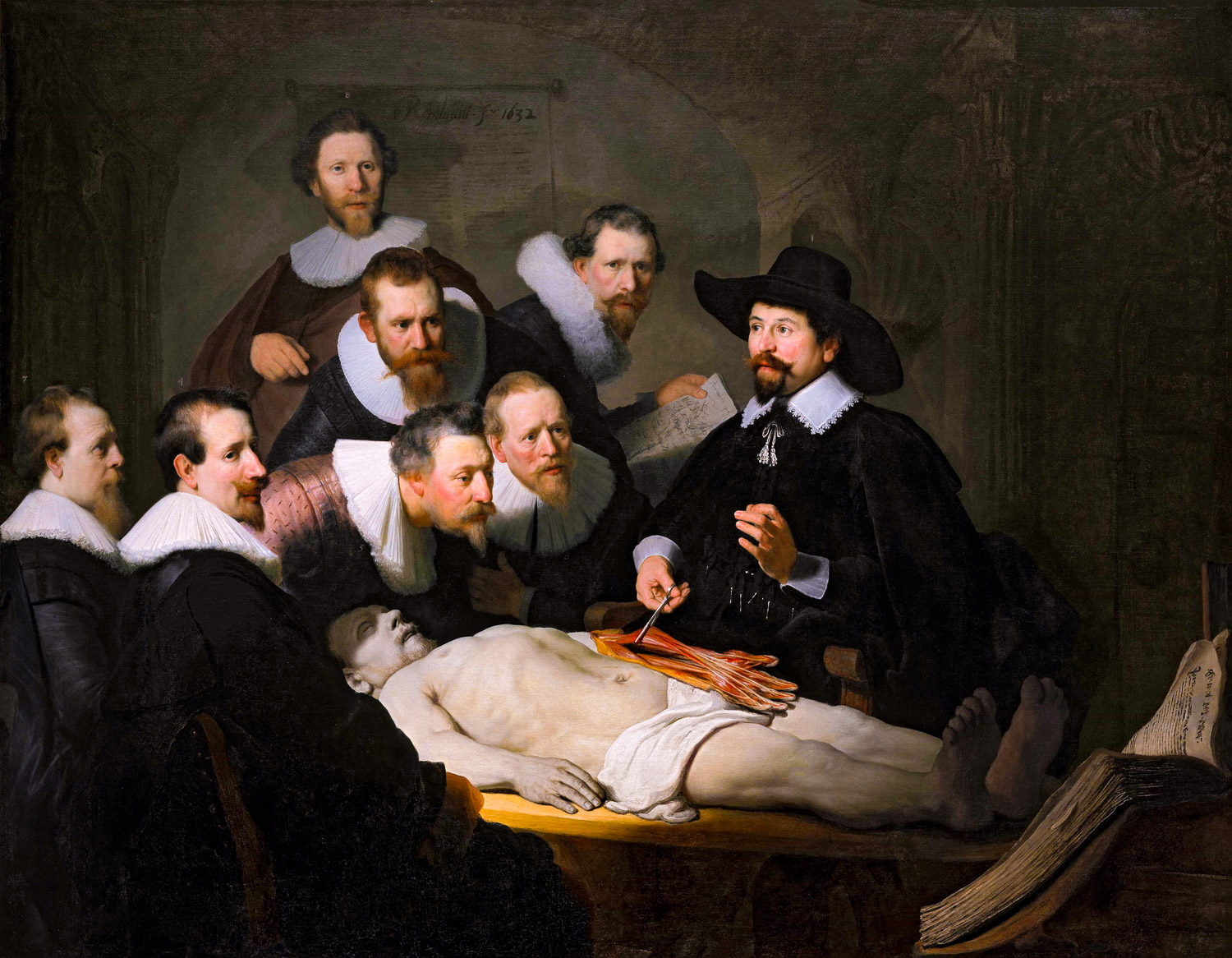
That’s how I ended up focusing on the following two paintings, which showcase a larger group of people:


The painting by Bartholomeus van der Helst is nice, but it’s a bit flat and the fact that people are posing also makes it less interesting (although in Rembrandt’s time, many people preferred van der Helst to Rembrandt precisely because his subjects appeared so rich, clean and fair, and also because he made them the same size and gave them each equal prominence – very democratic, which I personally don't like).
The things that drew me to van der Helst’s painting were that it portrayed a large number of people and that each has a different fashionable outfit. But, in my opinion, his use of light is rather boring and it lacks story or dynamism.
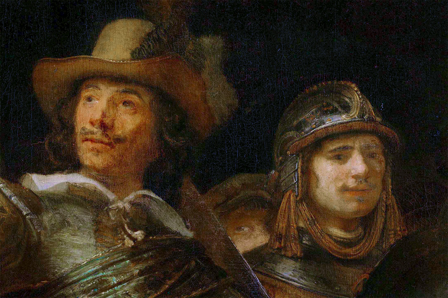
And then there was The Night Watch. I was initially very reluctant to use The Night Watch as my source of inspiration because it feels like such a common and expected choice. Above, I’ve shown you a copy of The Night Watch by Gerrit Ludens (in the Rijksmuseum you’ll find it located to the right of the real deal) because I actually prefer Luden’s composition. In Rembrandt’s painting, curators have cut off parts of the original canvas in order to make it fit into a smaller space. I really don’t like the composition in what’s left of Rembrandt’s masterpiece. It really bothers me every time I see it and I think that the Rijksmuseum should draw lines on the wall that show the original canvas to help people better understand the painting as it was intended.
As I said before, I arrived at The Night Watch reluctantly, but was struck by its dynamism. What makes it so dynamic? To start, the painting encompasses many different stories all happening simultaneously. On top of that, the painting also has a clear, central point of focus, which I felt would be important for the group portrait I was going to take (and, in fact, for any photo I take). And last but not least, of course, was Rembrandt’s rather dramatic use of light.
Rembrandt: the Night Watch (restored version with help of Gerrit Lundens)
In case you haven’t noticed yet: I actually ‘restored’ all of the paintings I'm showing you here – which is my attempt to show you how they may have looked back in the day when they were painted. Since some colours fade more than others and the blacks tend to become more prominent, I used Photoshop to reverse those effects. Why did I go through the trouble of ‘restoring’ them? Just as a little experiment to see what I’d get and because it's interesting. Especially in the case of The Night Watch here above, I'm much happier seeing the original composition.
Thanks to my visit to the Rijksmuseum, The Night Watch became the inspiration for my group ‘portrait-to-be’. My next problem or challenge was in making sure that the subjects of my portrait were all wearing different types of clothing. Unlike in Rembrandt’s painting, I wanted my photo to emphasise diversity by having the craftsmen’s clothing and props each reflect his or her trade. Although I did also want a unifying style since ‘too much’ diversity could come off as messy. Accordingly, I made two requests and crossed my fingers that it would turn out well: ‘wear dark clothing’ (for unification) and ‘dress nicely’ (because in the Golden Age people did their best to look good in a painting).
I also needed emotion. My initial idea was to capture ‘personalities’ (like in Rembrandt’s work) as opposed to ‘people with emotions’, but I worried that no emotion would appear dull and the craftsmen are anything but. That part puzzled me a bit since it was so ‘un-Rembrandt-like’. So, you could say, I added a touch of Frans Hals or Jan Steen in order to honour my subjects’ temperaments. The result gives you an idea of how they feel, but you don't really get to know their personalities. Here’s a Jan Steen painting to show you what I mean:
Jan Steen Beware of Luxury
Ultimately, I traded the depiction of personality (Rembrandt’s style) for emotion (more true to the craftsmen), but kept Rembrandt’s use of dramatic light, his portrayal of people as realistic and natural as opposed to idealised and overly fashionable, and his central point of focus. I achieved the latter by constructing a composition that included both the bulk of light and a strong local contrast in the centre of the image.
Here’s a close up of the centre of my ‘painting’/photograph. Sasha, who you can see sitting between two women, becomes ‘more important’ because she’s the only one actually looking at you (or is she?).
…actually, she’s not the only one. There’s someone else peering out at you, as well. In order to link my photo to The Night Watch even more, I repeated the same almost invisible, secretly peeking man that’s also found in The Night Watch (some people think this is Rembrandt himself):
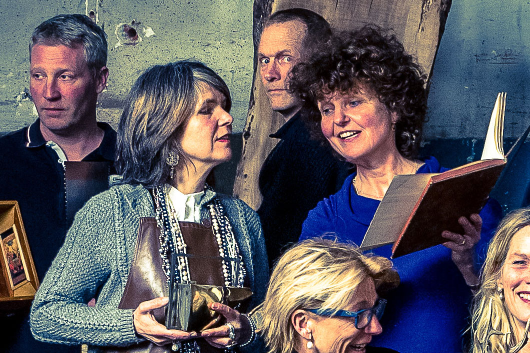
Interestingly, if you take a minute to really study The Night Watch, you will find that this almost invisible man, hidden behind the others, is actually the only person who’s looking at you from inside the painting. Nobody else is looking ‘outward’. Visit the Rijksmuseum and you will see.
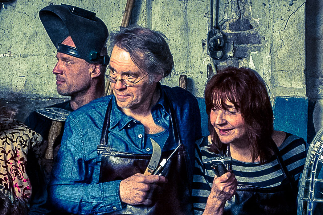
What’s also similar to The Night Watch is that my photograph also has many different stories, many different things happening simultaneously. Here are a few close ups, the details of which would easily be lost if I were to just post the whole image.


And finally here’s the photograph in its entirety.
Harrie de Fotograaf: Ambachten de Pijp 2015
Thanks for taking the time to look at my 'making of' this group portrait – made in old Amsterdam by a modern craftsman in the style of the city's heritage. And, last but not least, I’d like to again thank Arjan, my assistant at the time, for helping me with this rather difficult photo.
On July 12th, 2019 the Amsterdam newspaper ‘het Parool’ wrote an article about my photo and me.
At the opening of the Lang Leve Rembrandt exhibition in the Rijksmuseum on July 15th, 2019 AT5 television network came to interview me, you can watch it here.